Pens
Japanese Brush Pens (Fude Pens) Explained: The Three Tip Types, and Which One to Buy for New Year Cards
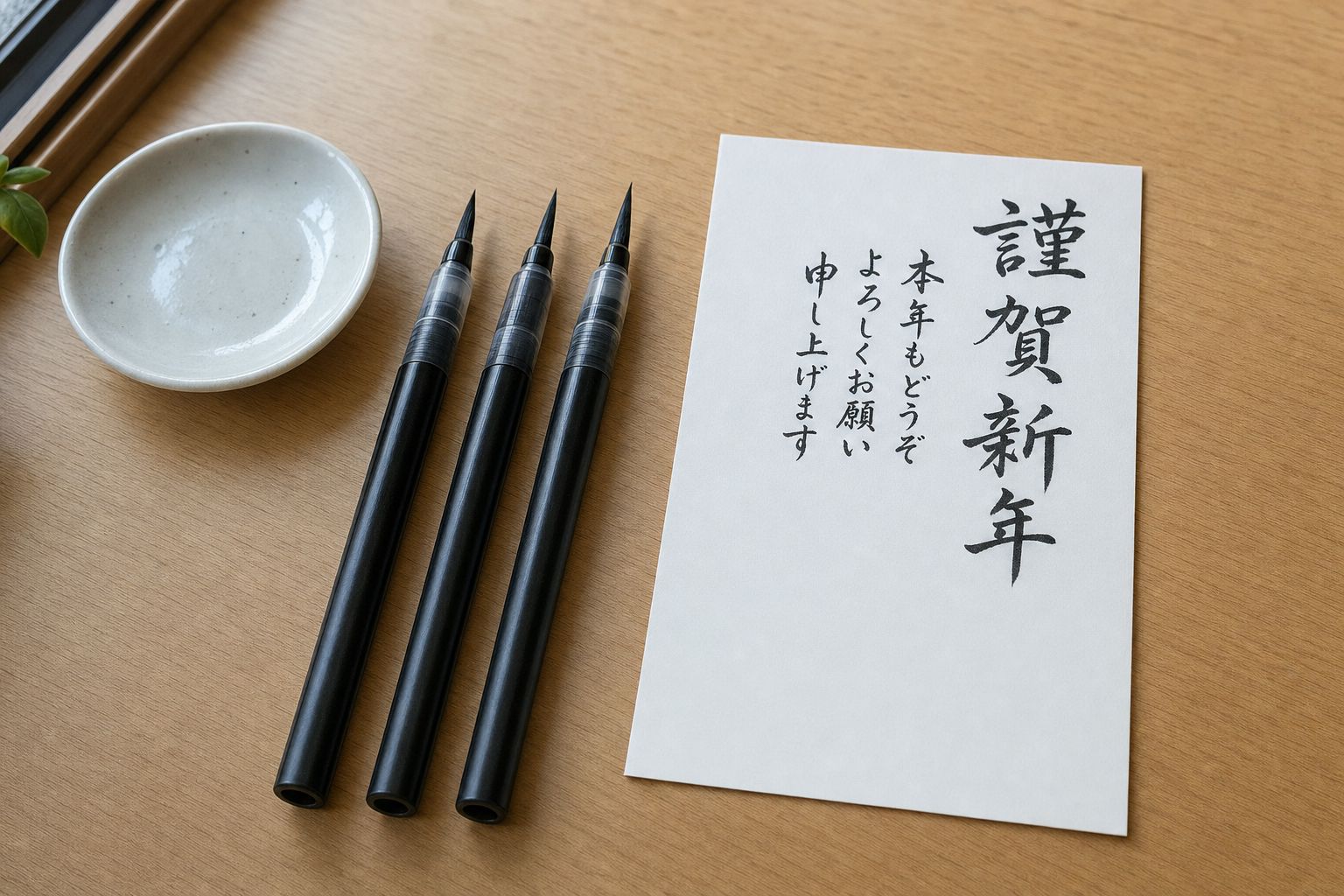
Around this time of year in Japan, a certain kind of pen starts showing up in store features and “best for New Year cards” guides, usually right alongside the postcards themselves. They look like markers. They’re sold as brushes. And most of the people buying them haven’t held a real calligraphy brush since elementary school.
The short answer: a fude pen (筆ペン, “brush pen”) is a pen built to make brush-style strokes, thick where you press and thin where you lift. They come in three tip types: firm felt-like tips that behave almost like a sign pen, soft rubbery tips that flex, and real synthetic-bristle brushes. For writing New Year cards, start with a firm or soft tip (the Pentel Fude Touch Sign Pen or Tombow’s Fudenosuke, both under ¥200 in Japan) and pick pigment ink if you’re writing addresses. Skip the bristle brush until you’ve practiced.
Why Japan has a whole aisle for this
Brush writing isn’t a hobby here. It’s school. Under Japan’s national curriculum, brush calligraphy (shosha, 書写) is taught from the third grade of elementary school, with roughly 30 class periods a year set aside for it. Since 2020, first and second graders even get early stroke practice with water brushes. So almost every adult in the country has spent years being graded on how a brush stroke starts, turns, and ends.
Then they grow up and write with ballpoints like everyone else.
The fude pen fills that gap. It lets someone who learned brush strokes at nine get something close to that look on a postcard at thirty-five, without ink stones, without a wet brush, without a mess on the kitchen table. That’s why they get their moment in November and December, right alongside the nengajou, Japan’s New Year postcards, because writing those by hand is the one time a lot of people want their handwriting to look like brushwork.
The three tip types, and why they feel so different
This is the part most English reviews skip, and it explains nearly every “this pen is impossible to use” complaint.
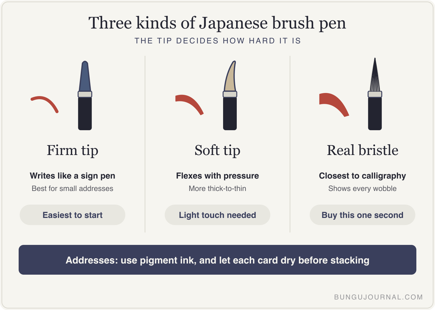
1. Firm tips (hard felt or fiber). These write like a felt-tip sign pen with a little give. You get some thick-to-thin variation, but the tip doesn’t collapse if you press too hard. Tombow’s Fudenosuke in its firm version (しっかり仕立て, “firmly made”) is the classic example. This is the easiest place to start, and it’s the one I’d hand to anyone writing small characters, like an address.
2. Soft tips (flexible elastomer or felt). These bend noticeably, so pressure matters a lot more. Tombow sells a soft Fudenosuke (しなやか仕立て, “supple”) with a special elastomer tip, and the Pentel Fude Touch Sign Pen sits in this group too. English-language lettering blogs tend to rate the Fude Touch as more expressive than the firm Fudenosuke. In my reading, that’s both the selling point and the warning: more line variation, but also more ways to wobble.
3. Real bristle brushes. These have an actual brush of synthetic fibers at the tip, fed by ink from the barrel. The Pentel Brush Pen line in Japan (ぺんてる筆) is the household name here, and its medium-tip model, the XFL2L, has been on shelves since the early 1990s. A bristle tip gives you the closest thing to real calligraphy, and it’s also the least forgiving. If you never practiced brush strokes, or you’ve forgotten them, the bristles show it right away.
The ink matters more than the tip for addresses
Here’s the detail that actually decides whether your card arrives looking right.
Most cheap brush pens use water-based dye ink. It flows nicely and looks rich black, but it can bleed if it gets wet. The Fude Touch Sign Pen, for example, is a water-based dye pen. That’s fine for a message on the inside of a card, which stays dry.
Addresses are different. A postcard rides through rain and wet mail bags with the address on the outside. That’s why Japanese stationery guides keep recommending pigment ink (顔料, ganryō) for address writing. Pentel makes a pigment version of its brush pen (ぺんてる筆 顔料, model XFP5M), described as water- and light-resistant once it dries. “Once it dries” is doing real work in that sentence, by the way. Even pigment ink smears if you stack the cards before they’ve had time to set.
So my simple rule: dye ink for the message side, pigment ink for the address side.
What’s actually on the shelf
| Pen | Tip type | Ink | Rough price in Japan |
|---|---|---|---|
| Tombow Fudenosuke (firm) | Firm fiber | Water-based | Similar to the soft version |
| Tombow Fudenosuke (soft) | Flexible elastomer | Water-based | Around ¥120 at a major retailer |
| Pentel Fude Touch Sign Pen | Flexible | Water-based dye | List price is ¥165 |
| Pentel Brush Pen, medium (XFL2L) | Synthetic bristle | Water-based dye | Around ¥390 at a major retailer |
| Pentel Brush Pen, pigment (XFP5M) | Synthetic bristle | Pigment | Higher, and refillable |
If you’re shopping from the U.S., the bristle option you’ll see most often is the Pentel Pocket Brush Pen (GFKP3), which takes FP10 pigment cartridges. Pentel’s U.S. product guide lists refills at $4.20 for a two-pack. It’s popular with illustrators for ink drawing, and its reputation is well earned. It’s also, in my opinion, the wrong first brush pen for someone who just wants to write a few cards.
The one I wouldn’t buy first
Don’t start with a real bristle brush pen, and don’t buy a boxed “calligraphy set” for New Year cards.
I know that sounds backwards. The bristle pen is the “real” one. But a nengajou address has small characters, tight spacing, and zero room to redo a stroke on a ¥85 postcard. A firm-tip pen gets you most of the look with far fewer ruined cards. Buy the bristle pen second, once you’ve decided you actually like doing this.
A small cultural note that catches people out: some brush pens come as twin pens with a regular black end and a pale gray end. The pale one is usuzumi (うす墨, “thin ink”), and in Japan it’s traditionally used for condolence envelopes at funerals, the idea being that tears thinned the ink. Tombow sells a twin like this (慶弔ツインS, “celebrations and condolences”). Don’t use the gray end on a New Year card. It sends exactly the wrong message.
Honestly, my own desk is a ballpoint
I should be straight with you: these days I barely use stationery. It’s a ballpoint and plain paper for whatever I need to jot down. So treat the opinions above as research and shelf-reading, not a long-term user review. What I can tell you is the part every Japanese adult shares: years of graded brush practice at school, and then a December where you suddenly want your handwriting to look like it again.
Mistakes that make brush pens look bad
- Pressing like it’s a ballpoint. Soft and bristle tips need a light touch. Press on the downstroke, lift as you finish. Most “blobby” writing is just too much pressure.
- Writing the address in dye ink. It may arrive fine. It may not. Pigment for anything that faces the weather.
- Stacking cards right away. Give each card a minute before it goes on the pile, even with pigment ink.
- Practicing on the real card. Do a few lines on scrap paper first. The notebook paper you already have is fine for warming up.
- Buying for the brand you saw online. The pen that’s best for big hand-lettering on social media isn’t the best one for small kanji on a postcard.
If you want to try one this season
Pick one firm or soft-tip pen, write ten practice lines, and see if you enjoy it. If you’re in Tokyo, the pen floors I covered in my guide to Tokyo’s stationery stores let you test brush pens on sample pads, which tells you more in two minutes than any review. And if you end up liking Japanese pens in general, my best Japanese pens roundup is the next stop.
A brush pen won’t turn you into a calligrapher. It’ll just make a card look like someone sat down and wrote it, which is kind of the whole point of a New Year card.
The Desk Reset (Free)
A 10-minute checklist to set up a calm, analog-friendly desk — built on 5S, Japan's tidy-workplace method. Printable, one page.
Get the checklist →